Our Brand

TierOne Brand

TierOne is an award-winning, multi-carrier solution provider committed to saving businesses time and reducing costs by designing, delivering, and supporting robust voice, cloud, and connectivity solutions.

The guideline contains complete instructions on the proper use of the logo, typography and images. You will also find a grid system for both printed and digital products, a system of icons and stationery. By adhering to these rules you will always get high quality, and you will also be sure that the brand is presented as it should be.

Before you start developing products related to our brand, please read this manual carefully. If you have any questions, contact us with any convenient way.
Brand Overview

Logos

Color Palette

Typography

Brand

Overview

Values

Lorem ipsum dolor sit amet, consectetur adipiscing elit. Suspendisse varius enim in eros elementum tristique.

Lorem ipsum dolor sit amet, consectetur adipiscing elit. Suspendisse varius enim in eros elementum tristique.

Mission

Lorem ipsum dolor sit amet, consectetur adipiscing elit. Suspendisse varius enim in eros elementum tristique.

Lorem ipsum dolor sit amet, consectetur adipiscing elit. Suspendisse varius enim in eros elementum tristique.

Logos

Get the Logos

Primary Logo & Scale

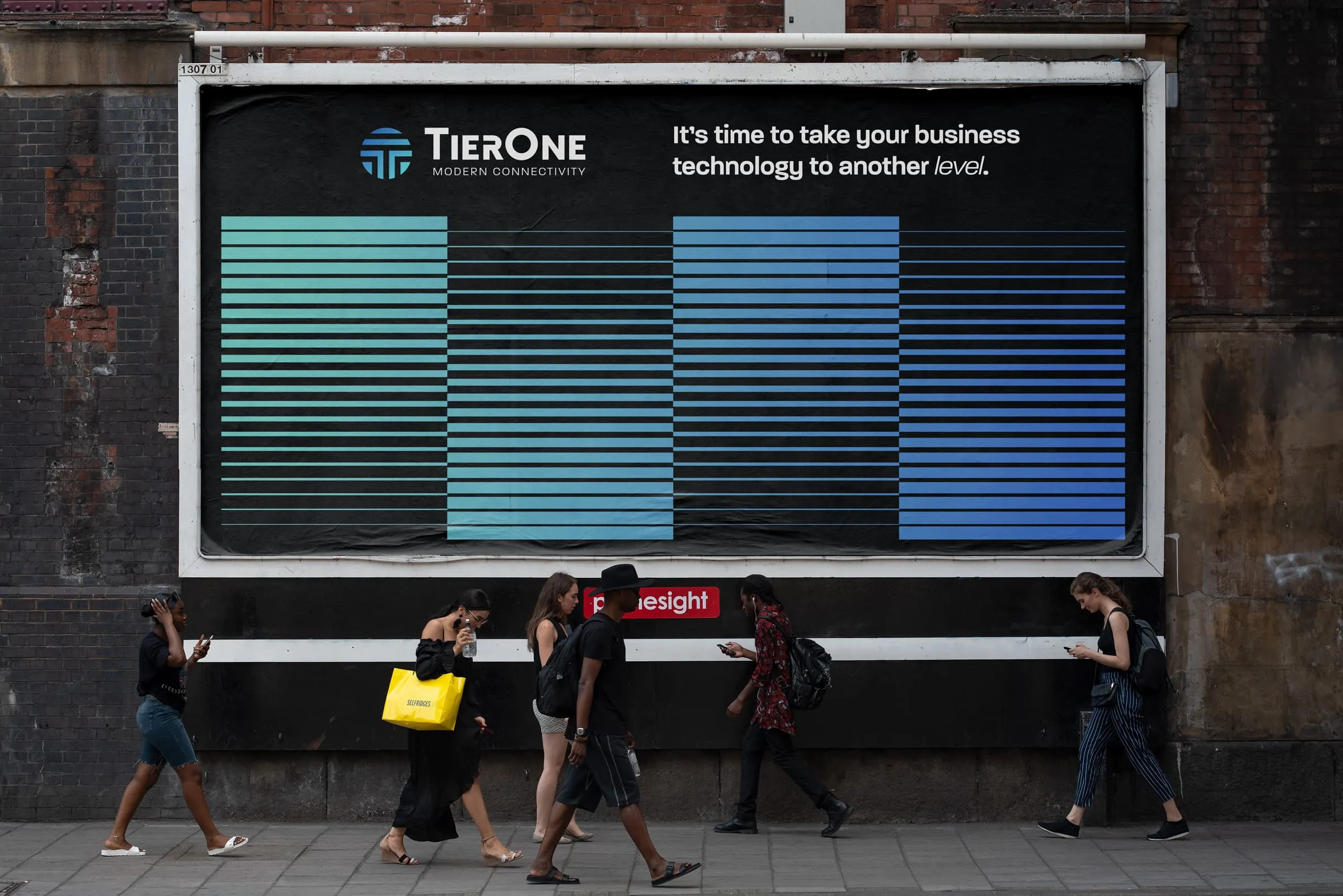
This logo is the central element in TierOne’s visual communications system. Through consistent and repetitive use, the logo becomes a visual shorthand which identifies the company and symbolically embodies its activities, achievements and goals.

The TierOne logo is meant to evoke timelessness and clarity. In an industry that is full of noise, TierOne aims to feel like a brand that is grounded, and yet evoke modernity and technology at the same time.

Mark
Logotype
Logo
Mark
Logotype
Logo

Construction & Clear Space

In the logo, the circular mark is representative of the cables and nodes that enable connection in the modern world. The strokes and spaces are all of one width, creating a precise grid in which the letter “T” becomes the focal point of the logo.

The clear-space of the logo should be a minimum of 2 of these grid spaces on any given side. This allows the mark to come across clearly and avoids any potential confusion or dilution of the brand.

Logo Color Variants

In the logo, the circular mark is representative of the cables and nodes that enable connection in the modern world. The strokes and spaces are all of one width, creating a precise grid in which the letter “T” becomes the focal point of the logo.

The clear-space of the logo should be a minimum of 2 of these grid spaces on any given side. This allows the mark to come across clearly and avoids any potential confusion or dilution of the brand.

Color

Palette

Primary Colors

Our primary palette could be thought of as our most used or most recognizable colors. The vibrancy of the palette brings our branded assets to life.

The TierOne logo is meant to evoke timelessness and clarity. In an industry that is full of noise, TierOne aims to feel like a brand that is grounded, and yet evoke modernity and technology at the same time.

Name:
CMYK:
RGB:
Hex:
XXX
XXX
XXX
XXX
Name:
CMYK:
RGB:
Hex:
XXX
XXX
XXX
XXX
Name:
CMYK:
RGB:
Hex:
XXX
XXX
XXX
XXX
Name:
CMYK:
RGB:
Hex:
XXX
XXX
XXX
XXX
Name:
CMYK:
RGB:
Hex:
XXX
XXX
XXX
XXX
Name:
CMYK:
RGB:
Hex:
XXX
XXX
XXX
XXX

Color Usage

Not all colors are equal in the TierOne brand. Although there is a time and place for everything, we lean toward the dark with a gradient accent. Follow the chart below to

Color Combinations

The following diagram demonstrates approved color combinations when using graphic shapes on top of solid background colors. These combinations are not intended to be limiting, but to demonstrate possible brand vibes.

Typography

Primary Colors

Our primary palette could be thought of as our most used or most recognizable colors. The vibrancy of the palette brings our branded assets to life.

The TierOne logo is meant to evoke timelessness and clarity. In an industry that is full of noise, TierOne aims to feel like a brand that is grounded, and yet evoke modernity and technology at the same time.